Geometric Design as 'Art'
|
'All Islamic artists make a deliberate error in their work on the grounds that Only God Is Perfect.' Thus goes a traditional explanation for minor irregularities in the complex geometrical designs of Islamic art.
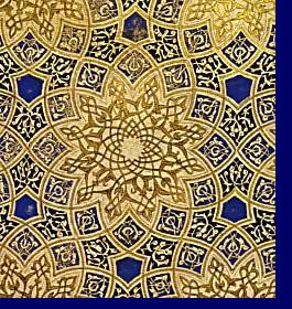
This account of deliberate errors sat uncomfortably with me to the extent that I sought the opinion of several respected authorities on Islamic Art. I was suprised to encounter a near universal reluctance to talk of such matters and where I did find interested colleagues I was told that their efforts to resolve this question had also gone unrewarded. Perhaps the saying concealed a more mundane truth. I felt compelled to investigate further. I began then with a theory of perfect geometric art and considered the 'straight line' and its definition as the shortest distance between two points. A moment’s thought tells us that since points have no dimensions, the line between them can have no thickness and since it cannot be improved upon in any way it may stand as our definition of a 'perfect' line. This is fine for theoretical geometry, but it's not much use to an illuminator whose stock in trade is a decorative border. Once a line has been given thickness it loses all pretensions to perfection. The extent to which much of Islamic design departs from the concept of geometric perfection goes beyond the mere thickening of lines. Indeed it is not uncommon for illuminators to adjust the position of some borders in order to visually enhance a particular design. A simple example will illustrate this. In 'The Quranic Art of Calligraphy and Illumination' by Martin Lings there is an illustration of a frontispiece to a Quran (page 71) of quite extraordinary beauty. I found deconstructing the pattern particularly difficult as long as I held to the tradition of laying borders such that their edges are equidistant from the geometric construction line (as in Figure 1). | ||
 | ||
|
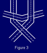
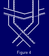
Eventually I had to accept that the illuminator had deviated from this method and that his motivation for doing so was in the best artistic tradition. He must have realised that by following common practice the width of the borders would have dimished the size of the smaller units of the pattern such that their original shape was entirely lost. His solution was to lay the border such that the construction line lay along the edge of the border (see Figure 2) | ||
 | ||
He thus preserved the integrity of the unit shape (see Figures 3 and 4) but sacrificed the perfection of the pattern as a whole. This, in turn affected all adjacent units of the pattern which also had to be adjusted, resulting in a pattern that deviates significantly from the geometric original.
| ||
  | ||
|
This is where 'art' supercedes geometry and it is practised by the Islamic designer as often as any other - and he knows it. Thus we have one example where there is no need for the artist to include a deliberate error. He already knows that his work is not perfect.
Having illustrated the deliberate distortion of geometry for an artistic purpose let us move on to some examples of the departure from natural geometry which are derived from a less benign influence. An imperfection is sometimes just an error, not a homage to a deity. | ||
|
||
|
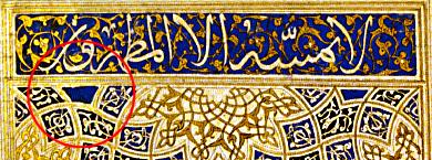
Even if we were to assume that this error was deliberate there is a second, even clumsier mistake in this illumination. Observe the circled section in Figure 6 and compare it to the equivalent section on the other side. It should be plain, even to the inexperienced eye, that they are not mirror images of each other as one would expect. In fact one arc has been drawn between the wrong pair of points.
| ||
 Figure 6 | ||
|
So, what do we make of this. The artist has been commissioned by an extremely powerful patron who expects the best possible work from his subject. Did the artist merely draw the piece and then hand it to an apprentice to complete? And what would have been his reaction on seeing the blemished product, with perhaps only hours to go before the deadline? He could always assume that with such a complex design no one but a fellow illuminator would notice, but just in case his master was more than a mere amateur in such matters, he might need a fall back position. What better idea than that of a deliberate error?
|
||
|
|
||
